Interview with Jeanne Detallante
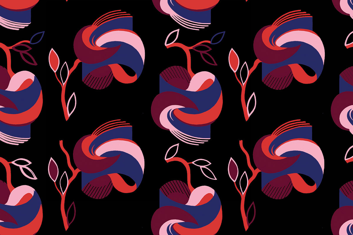
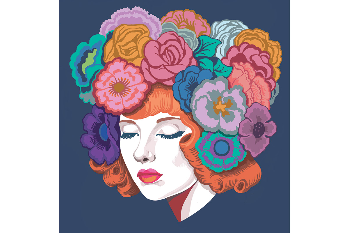
There’s no question Jeanne Detallante is one of the most talented female graphic designers working in the field today. The Parisian artist’s work has been unmissable in a range of titles, including Vogue Italia, Vogue Japan, The New Yorker and GQ and many others. It’s difficult to associate Jeanne with one particular style - she’s a natural shape-shifter, switching between surreal illustrations to ironic realism to vibrant jump-off-the-page graphics.
This exuberant flair has made her a name to watch in the art world and a favorite of brands like Prada. Naturally, The Future Perfect had to get in on the action with the company commissioning Jeanne for a range of work, including rebranding the company’s visual identity for Art Basel Miami. Lucky for us, the Parisian genius had 15 minutes to talk us through her work and inspirations.
How did your collaboration with The Future Perfect come about and what was the original concept for the work?
I was approached by David as he started a project involving artists working on the idea of The Future Perfect as an image. It was all about how to "illustrate" this concept.
What did you want to achieve with the work. ie. What brand values did you want to convey for the Future Perfect?
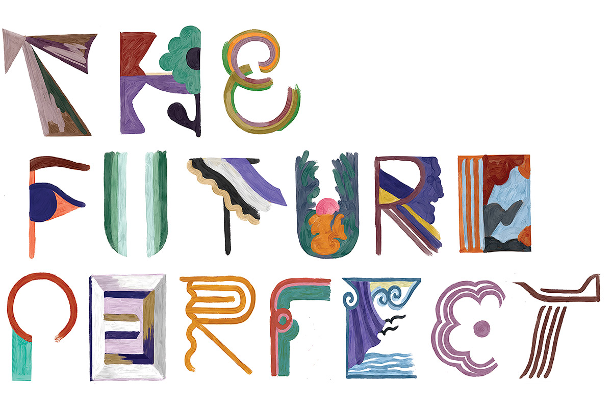
I love the name of the company for all the fantasy, irony and hope it carries. To me it evokes design in itself : looking forward to reach a perfection that is appropriate to its time and the era’s needs, skills and savoir faire. So I decided to work on a font that would say the name that would be visually at the junction between classic (symbols and visual qualities) and modern technology and interpretations. (The font is digitally "hand drawn " with a pen tool)
Your work is vibrant, often surreal and wildly original. How did you develop your approach to illustration/art direction and graphics?
By being very open to the visual vocabulary of culture and subculture and by finding interest in both good and bad taste. There’s meaning in everything.
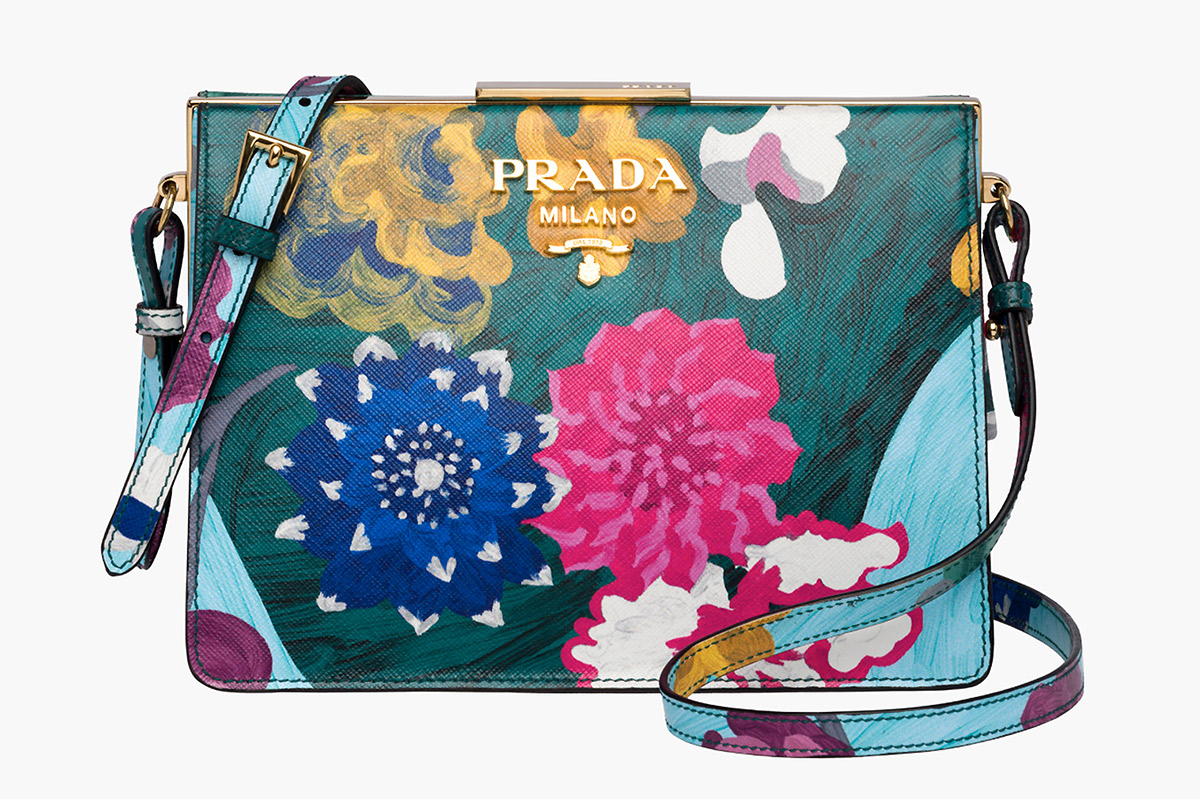
Prada AW17 Bag
Can you talk us through some of your other favorite clients and collaborations?
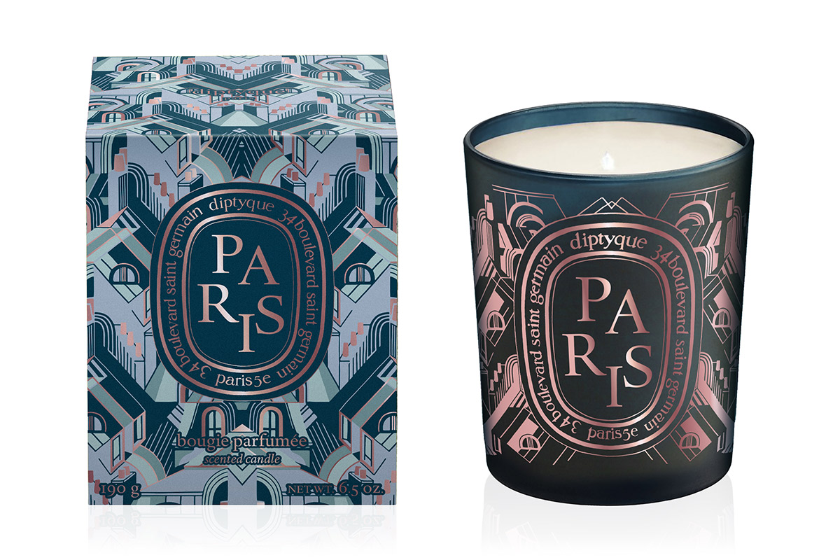
I most recently worked in collaboration with Prada for the FW 19 men’s collection and the Valentine Roses collection by Diptyque that was also just released. These two projects represent two very different approaches visually and that’s what I'm looking for in every project; to give a specific visual answer coherent with the mood of the projects.
Can you tell us a little bit about your path into design and some of the key inspirations and touchstones along the way.
My first big chance to actually develop a illustrated fashion story was given to me by Steven Meisel for the Italian Vogue thanks to my friend Jason Duzansky as he was working with him back in the early 2000s. I then started to work for press, mostly fashion stories, commercial works. I got to illustrate for the New Yorker. I then eventually got a chance to work on some murals for a bar in Paris, which eventually, somehow, got the people at Prada's attention. I was then offered to collaborate on both Prada and Miu Miu’s SS14 collections. Since then I've been looking for as many different projects as possible to apply my vision, from press to fashion, patterns, children books. I’m looking for a coherence through eclecticism.

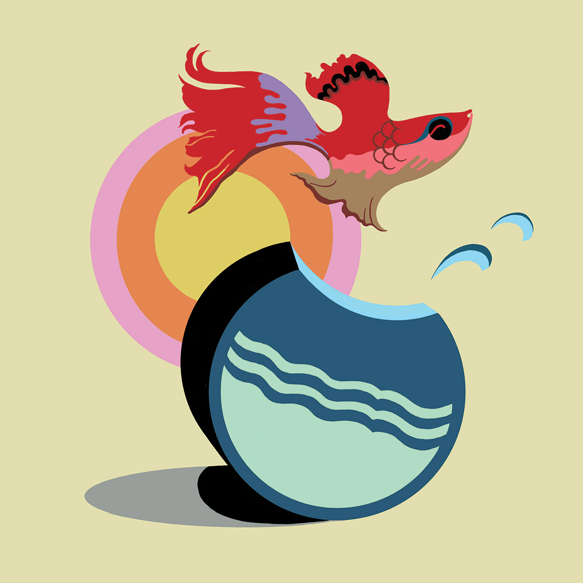
Miu Miu, Cat and Fish